Tuesday, September 1, 2020

So Much Scrap Paint – Addendum #3 & 4

All I'm painting these days are Addendum collection pieces.

I've been in the mood to clear out my storage of mixed paints before starting any nicer paintings. Making these two Addendums used up a majority, so I'm satisfied about that.

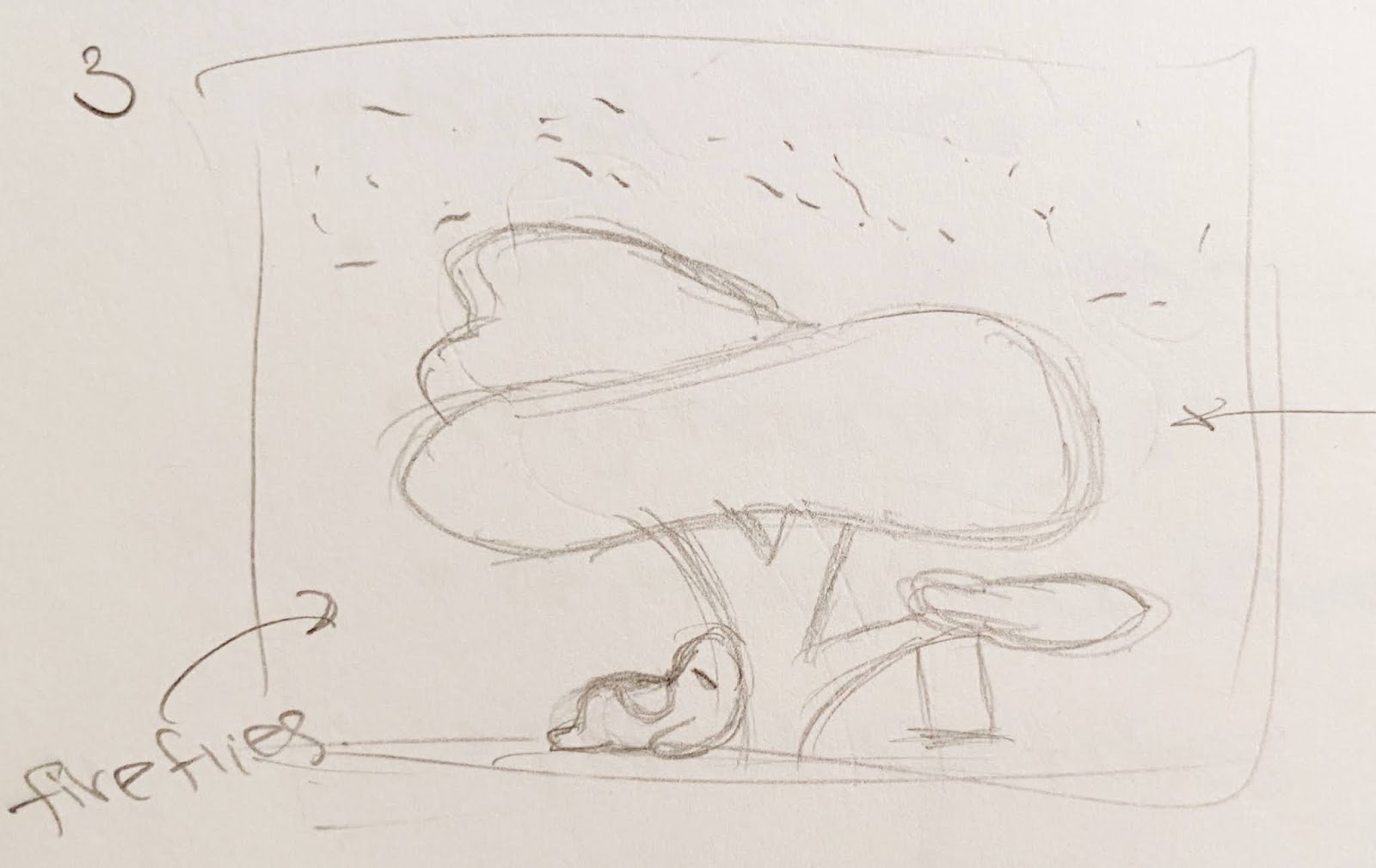
I still have some excess paint left, so it might take an ugly third piece to use up the rest of the forest green and bits of brown. (Note from Faith in the future: I made the ugly painting and the dissonant colors were so ugly that it hurt my soul. I have stashed the abomination in a corner, waiting to trash it. | A second update from Faith in the future future: I successfully got rid of the abomination. My sister wanted the wooden frame of the canvas for her own art project, so we ripped the painting out. I've been relieved of my burdens.)

Just imagine, all the paint on these two canvases would have been wasted if I didn't have my paint-saving system.

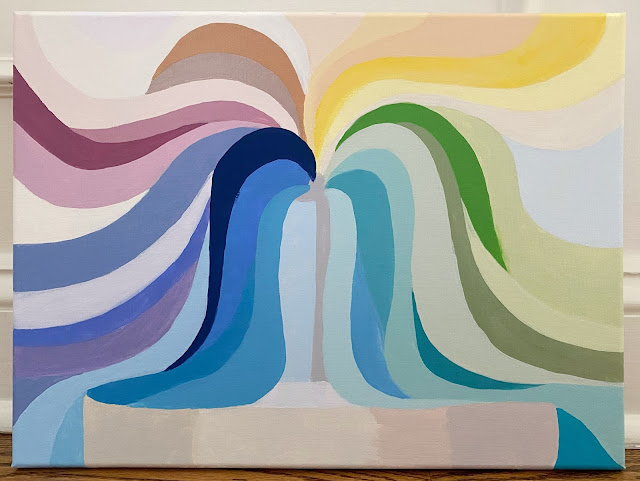
Addendum #3: Fountain

Addendum #4: Kitchen Apron
I forgot to put patches on the apron, which would have looked cool.

Tuesday, August 25, 2020

Again, Again

The Disney panel was really fun to paint, so I did another one. Because why not.

The character in the green square is based off of this cutie:

I have a few more ideas for small panels and it has been so nice to work on a smaller scale. However, I will want to bring back larger pieces soon. It'll be a nice challenge to try maintaining good composition while adding more detail with the 12x16's.

Sunday, August 23, 2020

Good, Clean Fun

Acrylic is considered the most accessible paint. It dries fast and it is easy to cover mistakes, whereas oil takes days for each coat to dry and watercolor goes south very quickly when you work on the same area for too long.

My gripe historically is that acrylic is too translucent. I have to layer over and over, for smooth flat color.

Thus is life, there is never not an element of banality.

In any case, it was fun to try these new paints which are formulated for greater opacity.

They are not truly opaque, *shakes fist*, but the colors are nice and bright. Using a paint marker for outlines, the final effect is quite cool!


Here's the experimental piece, that I used to play with the new medium. It turned out not bad as well.

Thursday, August 20, 2020

Honeymoon Phase: Capstone Collection (1 of 2)

This concept of flow, I am very entranced by.

I've noticed for several years that I am the best presenter I can be, when I find a rhythm  a rhythm where my thinking and my speaking are keeping pace with each other, and allows the audience to click in.

What if there's a flow you can sit on, throughout the day. Something that you ideally sync with how fast you walk, how you write, how you react, how you connect with someone new, what deadlines you take on or how you move between activities in the day. There is something to this concept that relates to awkward silences, having "chemistry", the x-factor and feeling in control.

Just an unsubstantiated thought that I've been floating around.

On a completely different topic, I have passed the honeymoon phase of my painting hobby.

Capping off this phase with a milestone project, I created a Christmas card series that is admittedly four months early and not all that Christmas-y. However, with some perseverance and a dash of creativity, it turned out really fun.

The central theme is a girl-wizard who casts ribbons, illustrating flow.

When the holidays get closer, I plan to clean these up digitally to make them print-ready. For now, I will share a preview and some artifacts.


NB: Hopefully, it's not too odd that the characters in this collection don't have eyes. My focus group says it is better not to mess everything up with freaky eyes. So painting eyes is next on the docket of things to learn.

Honeymoon Phase: Reflections (2 of 2)

Having spent last weekend upgrading my art space from two wobbly, folding coffee tables into a pitch-adjustable drawing table, I take a moment to reflect on this art journey so far.

The fact that I'm still interested, after several months and multiple waves of inspiration honestly surprises me.

Making art has been sort of like how my Christmas collection progressed. I wasn't in the zone at all initially and sat on the first panel for a couple weeks, not knowing how to fix a wonky wizardress. Then I moved on to the six other panels, painting the wizardress in various poses. By the end, it was eons easier to go back and spot how to fix the proportions of the first character. If something's not working, it helps to wait a beat, take a different route to sharpen your skill, and try again later.

Similarly, painting taps into a slightly different part of my brain. So I think this hobby gives me a sandbox and different avenue to strengthen skills like redefining standards of perfection (classic), being in the present, and constantly relearning that practice does make progress (that skills are not innate).

Painting sure beats spending the time just watching TV.

Blogging has also been a big part of memorializing my reflections and finalizing each piece. Looking ahead, I would love to increasingly enjoy the process and not rush towards the outcome. I'd like to be a little less controlling. To keep finding my style, hopefully maintaining a clean and appealing aesthetic while shedding the dreaded children's nursery vibe. And I hope painting continues to be interesting and moderately meaningful.

Also, if I can have an additional wish, I would like to learn to photograph acrylic paintings, so I can avoid shiny glare but preserve the vibrancy and brightness of the original. Truly the greatest, most underrated challenge of posting.

Thursday, August 13, 2020

Addendum #2: Coffee Cup

In the middle of my current painting project, I ran out of paint storage containers.

I meticulously save excess colors that I've mixed, so I can work on the same piece across multiple sessions. Now that most of the paintings corresponding to these shades are complete, it is time for a massive clean-out. 

But like any normal person, I have a deep-seated need to keep archives and general reluctance to get rid of things. For example, my biggest pet peeve is for meeting coordinators at work to delete the entire series of calendar invites when recurring meetings end. It destroys the record of past meetings that were linked to the series. Every time this happens, I just go into a corner to fume silently because I'm the only one who cares.

This is crazy behavior. But I digress. Using up these excess paints is mildly uncomfortable, but thankfully outweighed by the satisfaction of having clean jars. (And I have to do it regardless of how I feel anyway.)

This Addendum painting turned out quite nice, with all the pretty colors of past paintings. I like this series!

"Holy Grail" Hand Lettering Pen

My second greatest love, after list-making, is to compare products. For whatever type of item I'm looking for, I comb the field for options, figure out what criteria I care about, and ultimately find the Exact Product I Want. It is endlessly interesting and I have been making purchase decisions this way for as long as I can remember.

Sometimes, there is an obvious winner, such as Krispy Kreme for donuts. Other times, it is very sad that the product you envision does not exist (countless examples).

Things I have optimized include: Pen, work notebook, water bottle, neck pillow, phone, phone case, e-reader, online photo printing company, clothing subscription service, cardigan, sunscreen, toothbrush and toothpaste, makeup and skincare, home office setup etc.

On my latest kick, I sampled all popular brush markers. Truly, all the ones I could get my hands on during lockdown. Verdict: No perfect product, but Sharpie brush pens are 85% there.

The criteria comes down to:
1. Has good colors
2. Makes my hand lettering look good (nib size and bounce)
3. BONUS: Creates a gradient effect


In addition to Sharpies, I like the Pentel Fude Touch for the small-nib option, as concluded in my non-rigorous comparison log.

Frankly, most of these pens write well and it's primarily about what fits your personal style. The deeper insight is that through testing, I get to learn about the world of hand lettering in a very kinetic way, distilling what matters and establishing my own opinion and preferences. So satisfying!

Thursday, July 23, 2020

Berry Flavoring

I used to have a massive sweet tooth. I still do, but it's under control since my sugar fast in January. (By "sugar fast", I mean that I spent a week taking the NYT Challenge as a light suggestion.)

When in college, I would buy little tubs of meringue from Trader Joe's and eat them straight, several in a row. With my high tolerance, I would not get sugar headaches until meringue number 5 or 6. (And by that point, I had basically turned into a meringue.)

Even now, I maintain a small, child-like delight for Peeps and other artificial things. ...including black cherry MiO for seltzer, a close cousin of cherry cough syrup.

On that note, I would very much like to try whatever Italian soda I've invented here.

This painting took around three hours, which is incredibly fast for me. The process flowed well. I experimented with a few techniques and practiced layering "mountains". I have also been obsessed with this grape-y purple recently, and love how the colors turned out.

These smaller 5x7-inch panels have been very inspiring to use. My next project involves several of these panels, so it may be a while before I post another acrylic painting, assuming I pursue that idea.

Monday, July 20, 2020

Addendum #1: Paint Mop

I despise wasting paint. But when I cut back, I severely undershoot and end up not mixing enough for what I need. It is impossible to get the exact right amount out  that is a known rule of the universe.

For creativity's sake, it is better to overshoot. So with all the excess paint, I've decided to repurpose them to create non-serious paintings.

On blank canvas, I'll partition areas for every color of the rainbow. Then I'll add to the painting bit by bit with whatever I have leftover at the end of every paint session.

I am thrilled with this solution. I will feel less bad about extra paint and it's a good way to do more abstract paintings.

Moonbeams

My new painting, "Moonbeams", is an easygoing project.

Since I learn something new from each painting, today's lesson is that shadows and highlights aren't the chore I thought they were. As an unexpected benefit, shading also helps me agonize less over getting the exact right colors since you have more chances to balance everything out.

Speaking of chores, the biggest one is usually the background. Canvas absorbs a tremendous amount of paint and little patches of translucency has become the bane of my existence. I have to squeeze flat my precious paint tubes to get enough paint for full opacity, and I wince every time!

(I have since bought an economy-sized jar of white, and devised a solution to combat the scarcity mindset. More on that in the next post.)

Moving on to discuss this piece, I am particularly drawn to the straw grass and the shooting stars. They really help convey the vibe of a calm, soothing night in a not-so-distant land. The large, fluffy creature is also terribly cute.

My only complaint is that somehow, the painting feels a little pedestrian. That is to say, it is not as obscure nor a mishmash of concepts as most of my other pieces. A real departure from my style... hah! I love it.


P.S. Comparing to the original sketch, I forgot to put a swing under the lower branch. Is it better without it?

Saturday, July 18, 2020

Pet Projects

After a short break from painting, I got back into my painting happy place. I used a smaller canvas, which seems to be easier to paint. This one feels like a classic Faith piece, with the boxes, the animals and the list-like variety of elements.

The design was inspired by my favorite beach towel, and my recent (2-year) infatuation with cheetah-print clothing.

I love this painting. I like having an element of interactiveness, as people can identify the animal patterns and decide on their favorite. If they are so inclined.

Note that none of the animals here overlap with my animal pinball painting. Because we Never Repeat.


As bonus materials, here are two other small panels that I've held onto for several weeks. Both were quick and simple, but rather symbolic, capturing a key lesson from therapy and a tribute to the BLM demonstrations.