Friday, November 24, 2023

My Favorite Things, Revisited

Woo yay I finished it! I designated this Thanksgiving break as an art retreat, and it was nice to have this detailed piece completed for my portfolio this year.

Recently, the storytelling mode in my brain has not been fully functional, so I'll be speaking in bullets today.

Art process
• Ideation: Trying to move away from abstract, I went back to painting lists  the eggs depict pieces of art that I've loved recently (which reduced some work for me, since many of the images are copied). The nest concept is inspired by the pigeon who intrude my balcony and our ongoing battle for territory.

• Process: It took me a couple sessions to do the nest, and I'm relieved it came out well. I spent about 16 hours on the 14 eggs. A couple comments on my work environment, I listened to and finished The Seven Husbands of Evelyn Hugo ebook as well as most of The Witchtrials of JK Rowling limited series podcast during this project. Also, the lighting in my apartment is not ideal so I've found that application can be spotty or messy without me realizing it in the moment.

• Overall thoughts: Thanks to recent progress in therapy, I was much less hung up on how perfect/imperfect the output was this time. Having said that, the lowlights are that this piece is not particularly cohesive, and I tend not to like the landscape-y eggs as much (nature is not my forte). The highlights are that the concept is unique and I really like at least half of the eggs. One major thing I contemplated early on was whether I could make the eggs look more 3D, however I think that would require perspective warping, lighting and shadow effects which are well above my skillset.
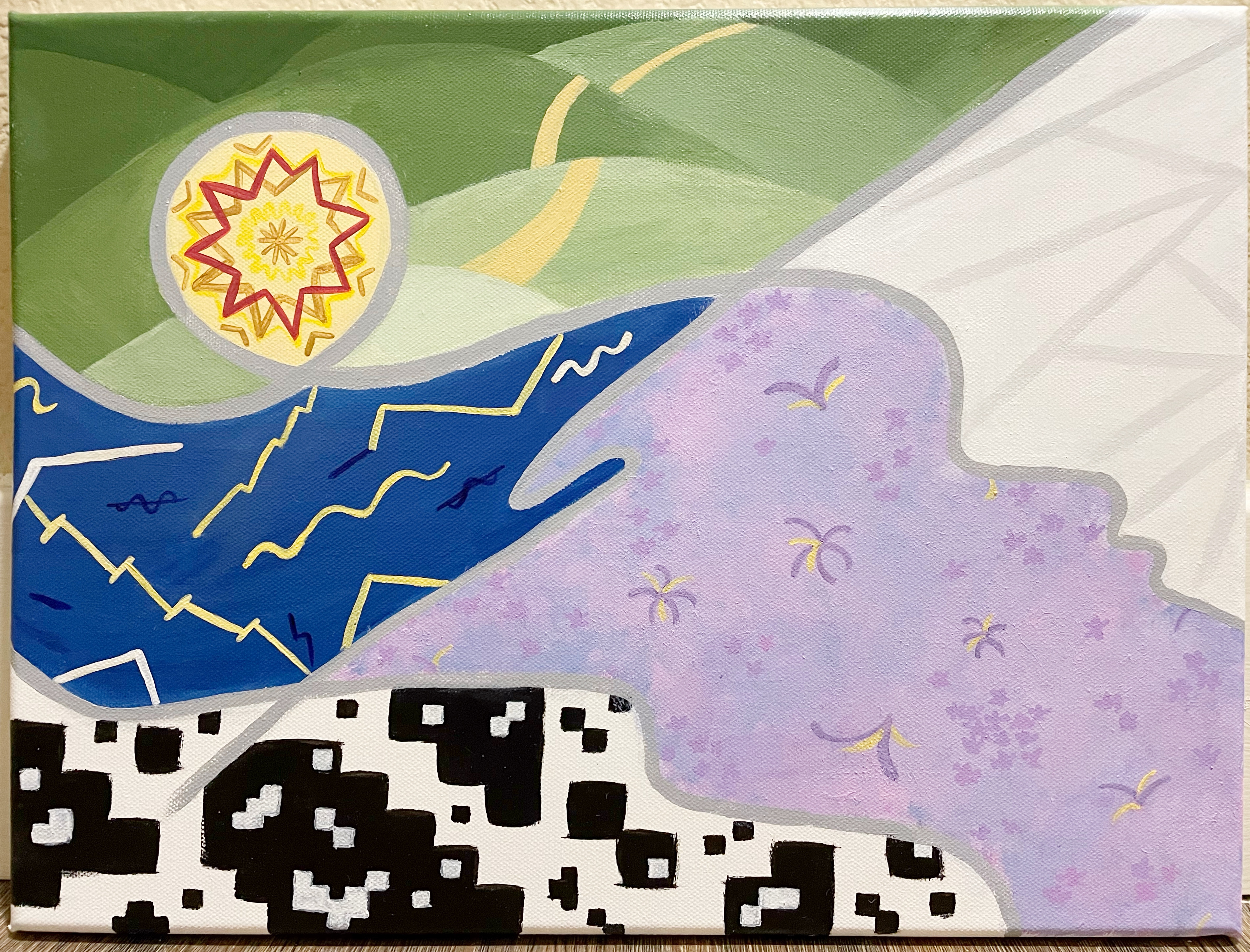
Egg List
If you recall, one of my first paintings was also vignettes of my favorite media. As before, I will discuss each egg starting from the top right.
(1) Karl Lagerfeld coat: This year's Met Gala Lagerfeld exhibit was beautiful and impressive.

(2) Yayoi Kusama's Death of Nerves: Another great museum piece; this was at M+ in Hong Kong. I did design the shape of the cords myself, inspired by the original.

(3) RM's Indigo: BTS members released solo albums this year, and I covered (my favorite) three in this painting. RM's egg depicts a mashup of two scenes from the Wild Flower music video -- petals in the wind at dusk and firework sparks in the night sky. As mentioned, I generally don't love the natural color palette and had to redo the dusk part once, but Wild Flower and the other music videos from Indigo were stunning and worth representing.

(4) SUGA's D-Day: SUGA's was my favorite concert I attended this year, which is almost blasphemy considering that Taylor Swift also happened. I initially put paintbrush to canvas for the teal jacket from the Haegeum music video, but I was too out of practice with detailed painting, so called an audible to paint the simpler Amygdala music video instead. The lyrics for both Indigo and D-Day are relatively profound.

(5) Jungkook's GOLDEN: Finishing off discussion of BTS, while I wouldn't consider GOLDEN to be the premier album of the year, the mini-concert depicted here was the pinnacle of a fabulous promotion period overall. This purple background was the beginning of Magic Shop, and the staircase was used for a surprisingly entertaining mid-concert chitchat. Good vibes to send us off, as JK and the other remaining members head off to enlistment.

(6) Gold Crown Ornament at Gyeongju National Museum (item 618): I didn't get much historical context on this particular artifact (don't come at me if this symbolizes something bad I don't know about), but it's no surprise this was a memorable museum visit in Korea, as I generally find Korea and dynastic Asian history interesting.

(7) Pickle by Moriah Elizabeth: As one of two art Youtubers featured in this egg collection, Moriah Elizabeth specializes in painting pastel rainbow plushies, and may or may not have a target demographic of <10 year-olds. Regardless, Pickle the Dinosaur is one of her classic characters and I watch her new videos upon release every Friday.

(8) Make Stuff with Stories by Nerdforge: Martina (and Hansi) from their Youtube channel specialize in epic fantasy-inspired creations, and Martina herself is a very talented painter. Depicted is the cover design of their sketchbook merch.

(9) Studio Ghibli scene: One more bonus Youtube-inspired piece, this egg was inspired by the jelly gouache painting videos that I periodically watch, which are so ASMR and clean. The execution turned out way better than I expected (but the egg shape made it hard to maintain straight lines and stay centered overall).

(10) Speckled robin's egg: I just wanted to put a regular egg in. I used the splatter technique, but didn't do it outside like I normally do, out of laziness, so suspect I'll be finding black specks around my dining room area for a bit...

(11) Watercolor sketch: I'm really enamored with a watercolor sketch-y style of tattoo that periodically shows up on r/tattoo. My vignette couldn't capture the thin black lines typical of this style. However, I love how the background turned out, in terms of the colors (which I fortuitously had in leftover paints) and the new technique I used to mimic watercolor texture. 

(12) Neon jelly: My favorite nail polish brand, Holo Taco, released fluorescent jelly nail polish this year, and one really aesthetic trend was to layer colors in a plaid pattern. I had to buy cheap craft store acrylic paint for this, so it really brought me back to the OG days of painting the same square five times to get opacity. The result is all bumpy, but I put real holographic nail polish on top, which smoothed it out slightly. The execution is unkempt but the egg is overall very cool.

(13) Dragon scales: I dedicated some time to learning how to paint scales. I want to make scales even more glowy/shiny/dimensional next time, but I'm happy with how this turned out, and think a dragon egg in this nest is awesome.

(14) Dewey beachhouse: Well, my dear friend and book buddy passed away this year, so I painted the view from her guest bedroom (where I always stayed) as an homage. We met when I was in first grade as part of a school reading program, and kept in touch through my childhood and then through her retirement in Dewey Beach. I'm sorry that I'm not better at naturalistic scenery, but the sunset is a callback to one of my paintings that she liked. I really treasured my time with her; may she rest in peace.
"Nest Eggs"

Reference images:
Links: [11], [12]

Tuesday, July 25, 2023

Addendum #10: Sandcastle

Phewph, I've used up all my excess paint! In addition to this one, I got through half of another Addendum before I finally ran out.

While this concept was the practical choice to use up large amounts of colors, painting it wasn't super enjoyable. Doing several Addendums in a row was getting boring and blocky squares are not my vibe. However, this does exude a certain kindergarten fun.

With that, I'm done with my fourth painting in 4 consecutive days. I have several great ideas on the docket, so I'm excited to figure out how to work on larger projects while maintaining the rest of my life (realizing now, I have not painted any major projects outside of quarantine).

Monday, July 24, 2023

Addendum #9: Cappadocia

As I said last time, I ended up doing quite a planned and high quality Addendum here, because I had so much excess paint to pick from.

I am in a very completionist headspace right now, trying to get through all this excess paint (don't know why there's so much). After the last Addendum on Saturday, I have taken 5 hours tonight (a weeknight) completing this painting and the base of a whole other one (just need to add detail). I wonder if I'll change my plans for the week and finish up the excess paint in the next couple evenings. (It will probably take me through to part of a fourth one.)

I've had this idea to paint Cappadocia for a long time, but never did it properly because it was on the cusp of being too difficult and not inspiring enough. Executing this idea as an Addendum was a good approach. My light critique of this painting is that the outlines of the baskets were an afterthought and slightly too dark, the two-toned sky is a little funky, the leftmost balloon colors is the least like the others, but the texture/depth on the mountains worked better than expected.

Yay, this was fun!

Saturday, July 22, 2023

Addendum #8: Planter

This one is quite cool! It reminds me of an art style I'll have to look up the name of later -- not exactly Picasso, but color block-y.

It would have looked really interesting if the leaves had more sections of different colors. But practically speaking, I have large amounts of paint in several colors, and was trying to get through them.

I still have a whole bunch of excess paint, and hoping to get through them in the next Addendum later this weekend. I've never started an Addendum with all the paint that I have to use, so maybe I can plan something more interesting.

Apparently, this kind of plant is called a Bird of Paradise.

Pastel Detox

I have been gravitating towards expressing feelings or concepts in abstract recently, but the thinking part of my brain also finds these less satisfying to paint or to look at. It can get boring quickly if I do multiple in a row.

So this painting is a compromise of real and abstract things. Similar to the last post, I still feel that my recent paintings are lacking in creativity/newness but also feel really me -- like that they always existed and I'm just manifesting them now.

I chose to do this painting over others that I might have been more excited to start, because I'm trying to get through my rainbow ideas and clear out my current paint pots.

The concept for this painting is focus, inspired by a fun concert I attended. I have resolved to being more focused/committed and that has returned good results so far:
-Focusing helps me experience more nuance and enjoyment, represented by the colored dots in the middle vs. gray dots on the edge
-But I also can't help that my thoughts wander to think about related things, indicated by the spotlights pointed in different directions and the many dots on the periphery

Application:
-Gradient backgrounds always make it more challenging/limiting in erasing/undo/fix what's on top
-The dots feel wonky and I can't put my finger on why. I used a dotting tool, and both the sizes and placement might be off
-This is a 5x7 panel

Anyway, it's cute, yay.
"What Do You Think?"

일코하려고 했었어요.
-"Love Yourself: Answer" color scheme was actually an accident. My intent was just to paint a regular rainbow with a different starting color.
-Blue and orange panels call back to the Agust D tour, with great efforts to avoid looking like UVA colors.
-Instead of pastel dots, I could used the bold red, green, and blue of the concert colors; but didn't think of it. It might have been more unique for my portfolio, but less representative of the concept/message, which is "happy".

Sunday, June 25, 2023

To Clutter or Not to Clutter

My urge to complete paintings in a timely manner comes at the cost of taking more risks. I notice that my recent paintings lack the pizzazz of my full vision, as I opt not to pursue the 20% additional detail which could take 80%+ more time (or risk ruining the painting altogether).

The specific issue is that I can't visualize the details until I actually put it down in paint. If it's complex, I could end up spending forever repainting until the details look right, so I usually go simple instead. That's what happened for this painting too. My original vision was a mosaic of different-sized rectangles that sparsed out (and became lighter) towards the outer edge. I was concerned about complex layout, time-consuming color-mixing and the possibility of triggering trichophobia in the final effect, so decided not to pursue it. In the end, I like this final painting up close, but the overall composition and coloring is a bit basic.

Painting discussion
Concept: This painting expresses loneliness. The center rainbow represents my fairly full and balanced life, but is blocked off from the gray border representing deeply integrated relationships.

Adjustments: Initially, the center rainbow was supposed to be missing one color and that color was supposed to be in the border. While that would have worked better symbolically, I didn't like the aesthetic of a colored border. Secondly, the center swirl was envisioned to be dark gray, but was replaced with a light gray during execution because I felt a bit lighter at that time. Lastly, the rainbow was supposed to be darker in the center and blend to a light pastel outward, but that proved to be impossible to implement.

Technical: 
-I'm happy with the blending, which has been difficult for me in the past. 
-I had a lot of fun with the painterly style for the border. 
-I spent a lot of time calibrating the medium purple and seafoam colors, and am really happy with the outcome.
-Challenges: The white walls are a hair too thick. The blend of the rainbow into the gray border was difficult. The area inside the white walls felt too small and hard to compose, especially with the swirl.

But overall, I really enjoyed making this painting. It took me about 10 hours, although ~3 hours was unproductive as I was watching a replay of the Agust D concert in Seoul, and ended up redoing most of what I painting during that time. lol
"Invisible Walls"

Monday, April 10, 2023

My Favorite Multiverse

I had a zen moment a couple weekends ago when I painted the first four panels here, without rushing through it or trying to make it perfect. I did not feel very busy, so felt like I could take the time. A lot of things are a state of mind; I can make myself feel really busy or not busy.  

This painting doesn't have much meaning; it's themes that I like, loosely inspired by a longstanding idea of portal doors. I usually try to be original, but some of these themes are inspired by past paintings and I'm ok with that.

The entire layout reminds me of my interior design painting ("Reading Room"). In order from least to most original (to my portfolio), the doors are:
-Jelly Jelly: A direct extension of my "Ribbon Collection" jelly panel, down to the color scheme and highlights. The new twist here is the jellyfish. 
-Confetti Museum: This has "Color Play" vibes, from the 5x7 rainbow panels I did.
-Cat Bus: Inspired by Cat Bus from Totoro; I have painted Totoro in "Animation (2 of 2)"
-Garden Arch
-Depression Tunnel: This panel isn't exactly a "fun door" like the rest, but it resonated with me and the aesthetic fit.
-Sorcerer's Atrium: I'm surprised I've never thought to paint magic before

I thought about redoing the bench in Cat Bus, but not sure I know how to make it better. I'm curious how I'll rank this painting after a little time passes. It's kind of interesting.
"Magic Doors"

Friday, March 17, 2023

Addendum #7: Octopus

Woo-whee another Addendum! Addendums use leftover paint, however I did sort of fix this one.

The first version was real cute! Very thrift shop-y. But when I looked at my Instagram feed, this seemed out of place, so I painted over some of the uglier colors. It was hard to go pencils down on this one. On the upside, after finishing all the fixes, I checked Michael's and extreme couponed some nice canvases, so it was a successful evening. 👌

What should I do for my next Addendum? Maybe a storybook pop-up willow tree, waterfall with rainbow rocks, a big leafy plant, a twisty clock. Might use some of these ideas for regular paintings.
New one

Original one

Sunday, March 12, 2023

Simple Systems, a Revision

I have reimagined the concept from my previous painting that failed in execution. Today, I painted from 10am-7pm, plus ~3 hours of "post-production" (and touch-ups). In other creative news, Next in Fashion Season 2 is back, and I am loving it.

Concept summary: This painting is about foundations. Six elements in six foundational categories: natural elements, types of intelligences, life purposes, basic emotions, the six quarks and fun punctuations (not a foundation). I noticed midway that this resembles a subway line map, but I think it works because subways are underground where foundations are. 😂

Overall assessment: I had a great time with the entire process; top 3 paintings in terms of enjoyment, a sign of personal growth.
-The visual concept came to me quickly, which is a phenomenon that always surprises me. This painting is a callback to my flower maze painting and my core style, being less abstract than my recent ones.
-A couple points of self-critique: I prefer the more organic feel of my original sketch, where I had looser lines that didn't align perfectly to a grid format. I didn't know how to recreate that in a painting.
-I also made a calculation error and added an extra row about 1/3 down. I could have used that extra space in the bottom instead. While at first this seemed like a major miss, it's more like a "happy little accident" looking at it now. 

All of these shortcomings can be attributed to lack of formal artistic study and also trying to go fast. But issues aside, I'm feeling less regret than I usually do. 8.5/10

Detailed commentary:
-The line colors are based on my iPad Notability palette, which I spent some time perfecting a while back, so it was nice to get more mileage from that.
-I tried not to overthink the icons, and just set the bar at elegantly simple but not too tropey. I redid an icon, so the old version is on my Insta and the new version is below. There were a couple other small details I didn't/forgot to optimize for (order of icons, which line goes on top).
-Noting that I needed to force-fit six elements per category. In particular, there are commonly eight intelligences, which I find to be excessive/indulgent anyway.
-Also noting I included the quarks category because I read about them in a book a long time ago and they fit the theme perfectly, but I fundamentally don’t know what quarks are.

Here’s the full log —
-Teal line (natural elements): fire, water, air, wood, stone, plants
-Magenta line
(intelligences): musical, logical, linguistic (mountain ie storytelling), relational, kinesthetic (sock), visual (squiggly)
-Lime green line (typical life purposes): for the moment, for growth/change, for influence, for knowledge/wisdom (notebook), for recognition (medal), for morality/deontological
-Wine red line
(basic emotions): happy, sad, angry (brick), afraid (monster in the dark), disgust, surprise
-Blue line (punctuations): asterisk, and, quotes, colon, bracket, degree
-Gold line (quarks): top, bottom, charm, strange, top, bottom

Original sketch

Epilogue: 
Thought #1
It occurred to me that I could have included seven deadly sins or seven senses (incl. balance and body awareness), perhaps instead of the punctuations. However, Sins seem to be quite similar to life purposes, and Senses are quite overlapping with intelligences. So that’s interesting

Thought #2
As a significant part of art is about expressing your style, the self-expression that I express today is structured thinking and colorfulness. Self-expression is very life-giving actually. It was on my long list of life purposes that I attempted to distill in a MECE way, and I think it is some combo of "growth" and "recognition".

Thursday, February 9, 2023

Random

I was cleaning up my OneNote, which I love to do. I love organizing my stuff in Google Drive, Windows Explorer, Spotify. Anyway, I came across a list of "New Year's" wishes that I was going to send on Christmas cards in 2021. I didn't end up doing it because printing was expensive and the Christmas card painting series didn't end up photographing well. But I remember drafting all these wishes when I couldn't fall asleep at 2am one night. I picked out a few here.

May all your dreams come true in 2021
May you go get 'em, girl
May you stay healthy and drink lots of water in 2021
May you always find 0% APR financing
May you never go without air conditioning in the summer
May you discover your all time favorite movie in 2021
May you sleep in without feeling guilty
May you keep on carrying on
May you just keep swimming
In 2021, may you enjoy good vibes, go hoos
May you work smarter, not harder
May you achieve the impossible and become even more amazing than you are in 2021

And then I wrote at the bottom...
"Oddly specific good things"
"Common phrases and generalities"
...to remind myself of the framework for how to write these wishes. Reading some of these again made me laugh; it's embarrassing but I seem to enjoy my own sense of humor. 😶

Monday, February 6, 2023

Just an Archive

I'm usually pretty self-critical about my paintings, but this one honestly feels like a dud. I'm posting it to keep an archive, but I'll keep this short and move on.

The original concept was to represent the MECE framework of life purposes that people can pursue. From top left to bottom right:
-Influence
-Personal evolution
-Recognition / approval
-Understanding
-Valuing the moment
-Moral rightness

In the end, I rushed through it in terms of visualizing the image and also executing. I'm not even putting this on my IG. Goodbye.

"Pieces"