Sunday, May 31, 2020

Ideal Reading Room

Last year, I bought a shirt with painted windows.

This shirt comes out of the closet whenever I need to break the monotony of wearing navy, head-to-toe for work. Because I love this shirt, the pattern became the inspiration for my next painting.

The original vision was to show a brick face of an apartment building with six windows peeking into six different-styled apartments. As the idea evolved, six apartments narrowed to three, and the windows themselves were nixed altogether.

In an informal poll, most people liked the top-right pink room the best out of the three.

My real-life room decor best resembles the pink room. However, I'm happier with how the other two rooms are painted, as they're more visually interesting.


This painting turned out quite faithful to what I had in mind, which is very satisfying. It is one of my favorites to date!

Tuesday, May 26, 2020

Too Complicated

I have decided to use only 12x16-sized canvases so that my art display is uniform. When I was younger, I had a recurring nightmare involving nothing but alphabet letters that grew and shrank randomly. I remember waking up in night sweats. Suffice to say, we should keep things the same size whenever possible.

I broke the rule and bought a bunch of small panels for fun. I initially intending to paint a Newton's Cradle on a small panel. Ill-advisedly, I expanded it to a full-sized painting.

Newton's Cradle doesn't work in a large space because good composition demands the swinging dots in the middle to be much larger than they are here. However, if I had made the balls larger, it would throw off realistic scaling compared to the rest of the scene.

Ultimately, the painting could have come together more coherently, however I still really like the individual components: the scene, the colors and the perspective. It didn't endure a lot of rework, so it's quite clean!


I present: Seven Dwarfs Dots on a Newton's Cradle in a Gymnastics Competition with Biased Judges.
Why settle for one idea when you can combine all of them.

From left to right:
- Grumpy (more
like Rage-y)
- Astonished
(replacing Dopey)
- Sneezy
- Anxious (replacing Bashful)
- Sleepy
- Doc
- Happy

Key skills challenged: Perspective

Eleven-in-One

I make lists for everything. I used to rate every granola bar I ate. I have documented every movie that I've seen since 2014.

On my list of favorite things in the universe, some random items include: golden doodle puppies and unicorn-themed color runs.

Wow, so basic. Let's try again. Some items on the list are: The Good Wife (TV) and Born a Crime (book).

BTW WARNING: Long post.

I painted 11 small vignettes of things I repeatedly enjoy, sadly excluding many TV shows that require drawing faces which I cannot do. As this is the first painting where I did extensive freehand, you can tell the quality improve as I slowly discover the right paintbrush to use. In painted order (click images to expand):

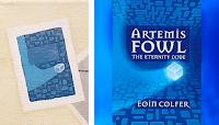
1. Artemis Fowl: The Eternity Code
All-time favorite book when I was growing up. I reread it ad nauseum. At one point, if you flipped to any page and started reading me a portion, I could recite back the subsequent sentences either verbatim or close to it.


2. Imagine Dragons: Evolve & Night Visions
Some great songs.


3. Tangled
Not my favorite movie, just a pretty scene.


4. Armchair Expert podcast, by Dax Shepard
This podcast is totally up my alley. Episodes get released at 5am on Monday mornings, right as I leave for the airport every week (pre-COVID). The routine of listening to an episode makes the start of the week feel like a blanket that slowly unwraps instead of a bucket of cold water being dumped on my head.

The podcast thesis is that being famous and successful isn't as fulfilling as people would expect. Dax teases out all sorts of interesting stories and glimpses into the inner lives of interviewees, often famous people. Fantastic.

5. GMK Dots
I recently had a two-week foray into the mechanical keyboard community.

This keycap design is something of a cult classic and resells for $300 on the subreddit. Just for the plastic part with zero functioning components! I did not buy it.

6. The Little Prince
A beautiful piece of literature.

I was shocked and amazed to have recreated the cover art in a recognizable manner. All thanks to my little round brush, which I have finally figured out how to use.
7. Ocean's 8
Honestly, this movie is a bit overworked and disjointed. HOWEVER, it is incredibly easy to rewatch. I find myself playing it in the background when there's nothing else to do, and enjoying the incredible cast of actresses more with each repeat.


8. The Incredibles
Another childhood favorite, my sisters and I were obsessed with this movie. We watched it in multiple languages. We voice acted all the Edna scenes by heart. To this day, I can still recite swathes of Edna monologue, with inflections in all the right places.

9. Contre Jour soundtrack
Contre Jour is an app game that I never played, but I instantly fell in love with its soundtrack. If I really need to focus at work, this is what I put on repeat. It's has an ethereal quality  ethereal like the balloons in Up, not like the new Taylor Swift Lover album. (Note from future Faith: What I meant was 'whimsical'.)

10. Harry Potter and the Methods of Rationality (HPMOR)
Fanfic at it's finest, HPMOR reimagines Harry Potter as a prodigy genius. My mind was actually blown with the ingenuity of it. The plotline has some uncanny links to canon, but diverges quite a bit into intricate plots based in real mathematical / scientific / strategic insanity.

It was still being written when I was in college. When it wrapped, I went to a physical, live wrap party with a bunch of strangers who also followed this fanfic. They were all nerds. It felt safe. But what in the world.

11. Sketch of designer dress with puffy sleeves
I love puffy sleeves. And I love the concept of designer clothing.


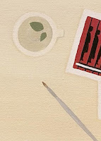
Finally, I added my favorite cup of mint tea and (now favorite) paintbrush to complete the illusion of an art studio desk.

When I finished the painting, I considered going back to redo the first few vignettes that were noticeably lower quality than the later ones. I ultimately decided not to, so that I can preserve evidence of my progression in skill. Additionally, I wanted to move on and not get stuck on refining the same piece forever. I think I stand by that approach, but it's hard.

Sunday, May 24, 2020

Rejected Gift

As a Mother's Day gift, I recreated an image (right) from the ethereal and imaginative app game, Monument Valley.

This is one of the few app games I enjoy. It is a puzzle game featuring Escher staircases and playing with perspective. The game is relaxing and mind-tickling, in perfect balance.

Is that a horrible adjective? Mind-tickling. It should be positive. But "tickling" sound a bit unnerving.

More to the point, I highly recommend the game.

I was dedicated to finishing this painting in time for Mother's Day. Otherwise, I wouldn't have been so motivated. It's almost a line-for-line recreation, which I find less interesting than designing original art.

Ironically, my mom didn't love this either compared to other paintings that I've done. She keeps asking me to trade.

No trades, Mom.

I agree the color selection is slightly bland, but I love how the characters turned out. And my Mom is just being facetious.

I learned a few new techniques:
1. Painting on hardwood board. Wood is much smoother than canvas, but you must prime it yourself, which requires a lot of time and patience in my amateur hands. Wood boards are good for special purposes, like to paint letters and tiny detail. Otherwise I prefer canvas better all around.
2. Using tracing paper. Tracing paper is handy but tracing is boring and hard.
3. Applying shadows. One good thing with copying art is it forces me to practice elements that are tough to figure out on my own. I understood shadows and perspectives a little better after this piece.

Saturday, May 23, 2020

Offcuts

There have been some duds, I must admit.

I have excised these Frankenstein paintings from my collection and never want to see them again.


Scrap 1: This was supposed to be a brick wall, with a musical score transposed on it. I couldn't get the brick color right, as it creepily looks like skin color. Even worse than that, overlaying music notes just makes no sense whatsoever given the offset nature of bricks.

I later reimagined the brick wall into a better idea, and have high hopes for a musical score design as well. Good ideas should not go to waste.


Scrap 2: I pretended to be Bob Ross and scribbled on canvas, expecting it to magically look good. It did not magically look good.

I also don't like landscape paintings anyway. I like clean lines and crystal clear images, which is very hard to reconcile with nature stuff.


Evolution of the Painting Approach

Looking back, the moment I decided to paint less perfectly, I subconsciously compensated by spending more time drafting and sketching.

More sketching is generally a good approach. It's much much easier to revise ideas on PowerPoint or a sketchpad than on canvas.

It's just very interesting that I can't relax the need for excellence, even with painting and I find ways to compensate when I deliberately try to reduce the perfectionism.
In the PowerPoint mock-up for this painting, people could not recognize the mountains and river. Some people thought the whole thing was a frog.

Hopefully, it's clearer on canvas that these are rolling hills and mountains. I decided quite late in the game to make this a landscape of Iceland, so added a fun camper and waterfall as distinguishing features  actually, commemorating a great trip from a couple years back.

Some of my photos from Iceland:

Thursday, May 21, 2020

Mimicking Art Styles

When people look at wall-sized modern art paintings with a single rectangle of blue, and say, 'anyone could paint that', I tend to wonder, 'could they though?'

You don't know whether you would pick a bad shade of blue. Or use an aspect ratio that is uncomfortable to look at.

There's balance in art, and I think detecting balance is a trained intuition. However I concede, to each their own. Maybe the reason I like simple, "abstract expressionist" work is because there's simply not much detail for me to nitpick...

I particularly like Jackson Pollock and Agnes Martin...
"Number 1, 1949", Pollock; "I Love Life", Martin

...and made a couple pieces inspired by their styles.

Splatter painting:
Splattering is SO much fun, flinging down trails of paint. I represented four favorite colors here: burgundy, pale yellow, medium-saturated navy and green-teal (whereas I dislike blue-teal very much.) Other colors I like include wine-magenta, deep rose, desaturated pale purple and burnt orange.

Special effect: the signature is traced and painted on clear acetate.

While I made this, my dad did his own splatter piece. He then glued springs and gears on top of his canvas, and it turned out great! What a fun bonding moment.

Line painting: 
A little fingerprint-y with the pencil marks, but I really like how the pattern turned out.

I won't be copying styles for a while after this, but I'm really pleased to have these two artists represented in my "portfolio".

Making Delightful Things

This painting helped me take risks and relax my iron grip on making perfect art. I know  fearless person that I am, I dared to try a weird idea in my zero-stakes hobby.

I reached a point in the painting where I could have stepped away – the rainbow scales were done, the fins and the face were one solid color. However, it looked rather bland for a multi-colored fish.

I was struck with inspiration for zebra stripes, but proceeded to hem and haw about whether it was too off the wall. As it turns out, zebra stripes makes the whole thing fabulous.


Art is about generating a feeling and memorializing it in permanent form. My goal is to delight myself, so I need to remind myself that my focus is to look for new and cool ways to create delight. Not aim for perfection.

I mean, perfection does delight me. But you know. Trade-offs.

Other interesting facts about this painting:
– Most of the colors are combinations of three colors only: dark blue, magenta, and pale yellow!
– I used a normal pencil to sketch outlines on the canvas and learned that graphite is hard to cover over. Graphite is oil-based, so it fights with acrylic. Watercolor pencils work much better – which I use exclusively from this point forth.

Friday, May 15, 2020

Nothing Has Changed

The digital art on the left features blue and dark magenta. I made it about 6 years ago.
Cut to this cartoon panel that I made a few months ago. Unintentionally, the exact same colors.

I love my magenta / burgundy. Tastes don't changed much. One time, I was lounging around at home with a burgundy-colored shirt on. Then I went to get dressed for the mall, and felt like wearing burgundy pants. Then at the mall, I decided to buy burgundy lipstick. So I came home wearing varying clashing shades of burgundy from head to toe. This was just a few months ago.

What can I say.

More Galaxy Themes

The concept for this painting was inspired by the Pixar short, "Day & Night". It is an incredibly sweet story and a very aesthetically unique concept.
The really fun part of this painting was making clouds with sponge technique and making stars with splatter technique. I try to learn a new technique each painting -- and am thankful that acrylic is mildly forgiving. The ability to fix and fix again is the only reason I don't scrap every painting I make.

As you can see, I'm still using tape to make shapes and haven't gotten quite confident with freehand by this point (which was around October 2019). Soon, soon, I venture to do more than just straight lines.

Additionally, I hadn't gotten the galaxy theme out of my system yet, but after this painting, I decided to stop with the galaxy stuff and get some new ideas.
I used professional grade paint for the first time on the Night sections, after I got fed up with 
layering cheap paint many times for proper opacity. 

First Real Project

Painting is only worth the time if I find a concept I'm really excited about. Usually, ideas start with something that I like in general. Then I improve the concept several times until it becomes so awesome that I have to create it.

I really love brainstorming at night, because I come up with a lot of fantastic ideas. But then, without fail, I wake up and find that only about 20% of the ideas are actually decent. Pre-sleep alpha waves are like my LSD.

With this painting, I knew I wanted to do galaxy colors, and the gradient concept added the uniqueness I wanted.

An unexpected result of the gradient was that it made execution ten times more complicated. Triangles had to be pretty small for a smooth fade. However small triangles in random patterns looked wonky and jarring, so I had to adjust each tape line over and over until it looked right.

Despite the time-consuming and onerous effort, I love how it turned out and I'm very proud of it.

A Personalized Space


Something I love about working from home is being in my own space.

After years of working in different offices, sitting on lumpy chairs and using chipped furniture, being in a room surrounded by my own decor makes a huge difference.


The key principle for interior decorating is to pick a prevailing style, but to include 20% of materials from other styles. I haven't done a super job of that at large, but came up with the piece below to bring in different textures.

It took some time to decide on each bottle. I think the ball bearings (third bottle) looks a bit too heavy. Rose gold ball bearings would have worked better, if those exist. However, I like it overall and am especially happy with the dried cornflower and patterned pins, which are high quality finds from etsy.


Wednesday, May 13, 2020

Reviving This Blog

Hello. It is 2020. We have been quarantined for 8 weeks. It's time to revive this blog.

I've been making a lot of art. I don't share it all on Instagram, because I don't want a profile of 10 consecutive paintings. Additionally, the design process is really fun and interesting for me to talk about, and yet my sisters cannot listen to another word from me. So I need a new outlet...


New watermark
Almost exactly 4 years after abandoning this travel blog, I'm fixing the broken links and giving it a second life for art stuff. Somehow, this blog platform is even more outdated than before and my old email subscription engine broke. You can subscribe again here or in the left bar -- and you'll get post notifications in a pretty, new email template.

Revisiting this old blog, I still like the design a lot. However, some of my old writing is super cringe. So be kind, and maybe don't judge old posts. And I'll be kind to myself too, because I'm 90% sure this post is going to be cringe-inducing in a couple years as well. Or way sooner!

That's all! Welcome back, us!


If you're interested in more rambles about what's transpired over the break...

Before I abandoned it in 2016, this blog was a creative outlet that helped me find some balance to an all-consuming new job. When I got busier, I stopped investing the 10-15+ hours it took to create each post. But along the way, I also lost touch with a huge piece of creativity in my life, and forgot the joy of obsessing over side projects purely for the fun of it.

This time last year, I took a long vacation from work and stumbled into acrylic painting. When I picked up a creative hobby again, it was like opening a cupboard of favorite snacks that you had forgotten about. That's simply not done!

Now, being in a different place in my life, art means something different than before. More than ever, I need it as a way to stretch my mind, think non-linearly and embrace that there's no perfect standard. I am still low-level anxious to finish each painting as quickly and as close to my vision as possible, but I'm working on finding ways to enjoy each part of the process as well. I hope you enjoy going through this creative process with me, if anyone out there has more patience to listen than my poor quarantine buddies!

Faith