Sunday, February 21, 2021

Learning Korean

Things have been busy lately, but I decided it would be good to make some art this weekend.

Swirls are usually easy, but they were difficult here because of the large space I had to fill. The final result is acceptable, but not as organic as I'd like.

You can see the swirls are traced in Korean lyrics, a shoutout to my new side hobby. As an adult, there are things I thought I wasn't good at or interested in that I have changed my opinion on. Learning a language is one of them. Apparently, my memory is not as bad as I thought, and I like the intuition required to understand the spirit of words.

I have a friend who is learning Korean like I am, and we agree that it is a particularly fun and interesting language. The writing is nicely uniform and, as with other languages, it's insightful to learn how cultural norms are imprinted into grammatical structure. 

Okay. With only the swirls on the canvas, I was dismayed that it was feeling unoriginal, looking suspiciously like Chinese Bible tracts I saw around the house in the 90's.

So I brought in some Little Twin Star vibes, and somehow that saved the painting. Done!
"Blossom". The yellow bits are warm metallic gold in person.

Addendum #5: Hair Bow

I quite like the concept of this Addendum. 

It's been sitting around, waiting to be completed for a while. It's time I clear it off the docket to start the next one, as I have a lot of purples in storage that couldn't fit here.

Saturday, January 2, 2021

Starting to Put It Together

Happy 2021!

Even though I typically don't make resolutions, one of my key goals nowadays is to appreciate both the negative and positive things in my life. I don't have to like everything, but it's good to recognize the inherent value in experiencing things. This approach should broaden and balance my perspective a bit more.

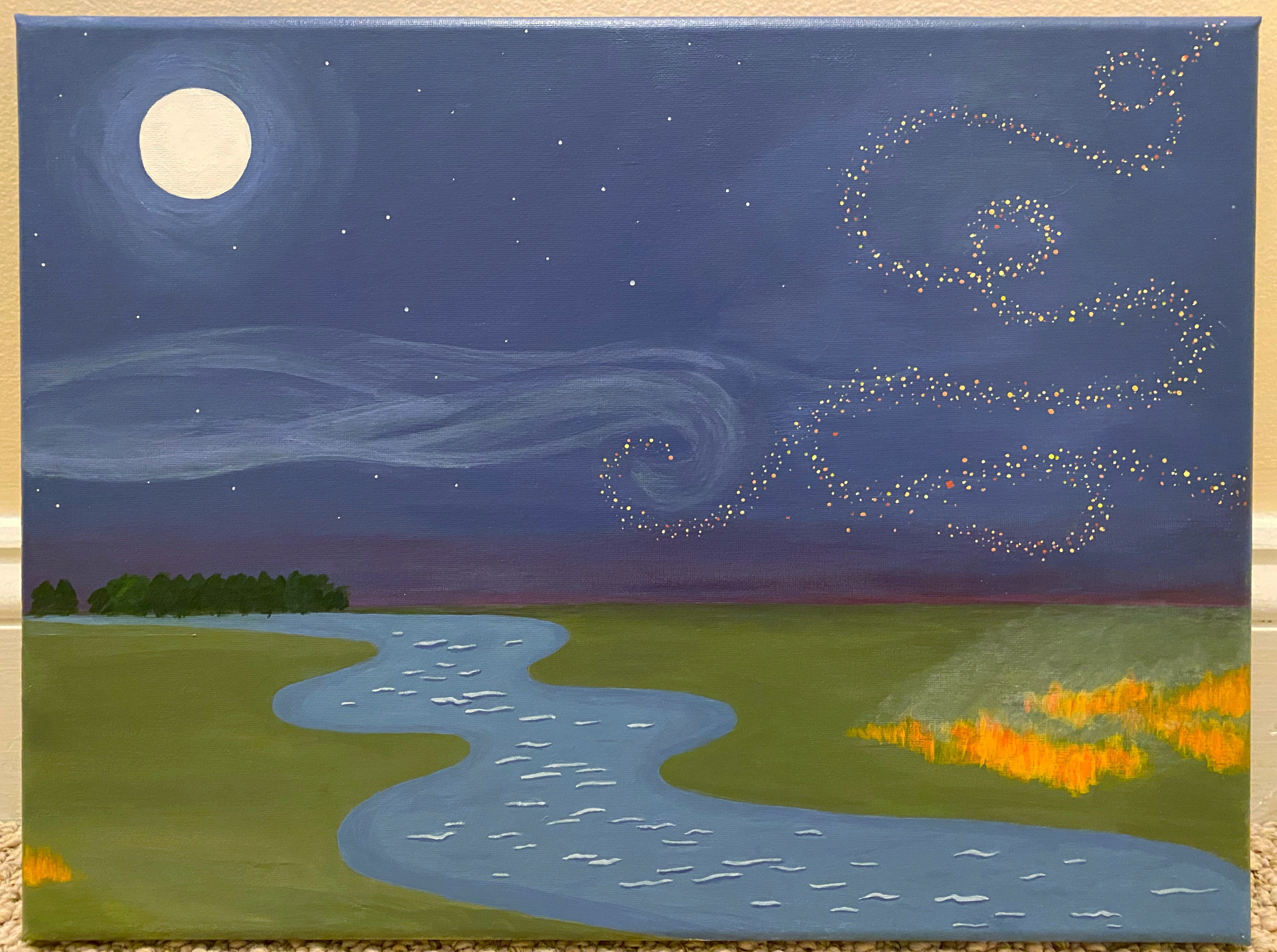
Moving on, I am very pleased to have made a painting so quickly at the start of this year. The concept was an engaging one, as I challenged myself to take the following elements and find a way to harmonize them: trees, water, fire, moon, stars, wispy clouds and swirling leaves (later changed to abstract specks).

I developed a backstory for how the elements fit together, but it's rather metaphorical and specific, so I don't think it's necessary to explain. As a result, this is one of the more non-literal paintings that I've made. Suffice to say, developing an underlying narrative from a loose theme made for a fun process. 

The painting also presented technical challenges in my key areas of growth, which are composition and nature realism. Overall, I rate the execution a generous 7.5/10.

Development
In making the sketch, the first question was how to depict fire, specifically a non-man-made one. You typically think of fire as a vertical object, but it needed to be horizontal to agree with everything else. Thus wildfire on the plains worked really well.

I didn't want fire to be the focal point, so I kept its footprint small. Instead, I built the point of interest around the coil where the cloudy haze and the swirling specks intersect. With those key points in place, the rest of the elements quickly got sorted out.

Evaluation
Overall, the painting is pleasantly subtle. It could have afforded more brainstorming time to improve the composition and more painting time to improve the natural texture. (More detailed commentary at the bottom.)

On the other hand, I'm very impatient these days. Many an idea has been lost to refinement-purgatory, so I'm glad I was able to manifest a fairly cohesive piece.

In conclusion, though it's lacking in some ways, I made it with care, with the dexterity that I've been developing, with an eye that distinguishes my style, and with an idea that came from my heart. Happy start of a new year and may we have the best year we can!
"Coherency"

Additional commentary and points for improvement:
For better composition, I could have unified the elemental shapes under a stronger rule/pattern. Additionally, the cloud coil should be more natural, the swirling specks should be simpler, the smoke from the fire should be more inspired, and the stream is overall very wonky (complicated by my inexperience with perspective). I'm not entirely sure that the placement of everything is right either.

Interestingly, the top and bottom half of the painting look all right separately.

As for nature-painting technique, the grass and stream are too flat and it only just now occurs to me that the fire should emit a glow onto surrounding grass.

Anyway, I better try to workshop each of these skills separately in the future, and stop analyzing this painting now.

Sunday, December 13, 2020

Do Something

With my previous painting, I did the background and left it sitting around for a month before finally finishing it.

To avoid this type of situation, I prefer doing simpler paintings now. I'm also inclined to be more relaxed in order to focus more on conveying feelings and to train my intuitive ability to make things look good without extensive pre-planning.

Having said that, here is a painting that could have used a smidgen more prep work. Somehow, the focal point and angles are slightly off. 

I will try a more balanced approach to preparation next time. On the up side, I think the patchy rays turned out really cool, and the rainbow colors are of course my trademark and my love.

There's a graphic novel feel that I wasn't exactly expecting.

2020 Christmas Cards: Ribbon Collection

It's time that I post my ribbon paintings in full resolution, now that I've decided not to send them out as actual physical cards.

Unfortunately, I wasn't able to print them into Christmas cards in a nice and inexpensive way. Additionally, I didn't have a particular message to send to friends during this pandemic year.

Anyway, looking back at these paintings, I surprise myself that I had so much motivation and patience to finish the whole collection. Painting is a very arduous process for me, because I am in nonstop evaluation mode over whether the painting is turning out how I want, when I'm painting. On a random note, this is how I drive too. I subconsciously continuously micro-adjust the wheel, and I've been told that this is not normal.

I'm so glad that I have these paintings to capture my peak skill, back when I was painting frequently.

Holiday Gala

Tiffany's

Water Current

Galaxy

Color Run

Designer

Jelly Donut

Thursday, November 26, 2020

Another Day

Sometimes pandemic days feel like time without markers, just continuous targetless time. 

I wanted to capture my current feeling that nothing is happening, and that this is both a positive and a negative sentiment. I didn’t set out with such a clear articulation in mind, but I think the result reflects this duality of a stillness that lacks nothing, yet also a sense of wistful aloneness that is 2020 quarantine life for me. (Ah, art.)

Talking through key elements, I was really loving the aesthetic of a sunset rainbow gradient when I started this painting in mid-October. The technique for a perfect gradient is still a mystery to me, but it was cathartic to just sweep the brush back and forth for a couple hours.

The cliff is lightly inspired by McAfee Knob (March 2018). Expansive views are healing for the soul and that is one of the things that we have been missing, due to quarantine. 

Lastly, the angle of how the girl sat was very important. I didn’t want her too crouched over – too inward and depressed. Nor too leaned back – too open and free. Something in the middle is just right – relaxed, pensive and a little self-protective. I’m not sure I got it exactly right but it’s close, and … I love how the purple sweater turned out.

"Another Day"

Arts and Crafts

Not too many paintings were created in Q4 2020. I have temporarily moved on to several new hobbies.

However, I painted a couple basic panels for decorative purposes. 

This purple one is a polaroid photo frame for my sister's birthday.

The green one was supposed to fill a gap in my Zoom backdrop, but it wouldn’t stay on the wall (read: I didn’t make an effort to find strong tape…). Now, it lives on a shelf with my other 5x7 panels. The hand lettering creates a nice effect, though it takes more steps than I imagined between drafting with a brush pen, tracing, and laying down paint with a Posca pen.

I feel satisfied that I've acquired the basic competency to put together these functional projects easily. 

Having stepped away from making art daily, I’m surprised by how many art supplies I bought and how much I painted within a short amount of time this year. I like learning new things in an immersive way  focus is the key to doing anything quickly and well. However looking back at these phases always gives me the feeling that I was in a quasi-fugue state (but a good one).

Tuesday, September 1, 2020

So Much Scrap Paint – Addendum #3 & 4

All I'm painting these days are Addendum collection pieces.

I've been in the mood to clear out my storage of mixed paints before starting any nicer paintings. Making these two Addendums used up a majority, so I'm satisfied about that.

I still have some excess paint left, so it might take an ugly third piece to use up the rest of the forest green and bits of brown. (Note from Faith in the future: I made the ugly painting and the dissonant colors were so ugly that it hurt my soul. I have stashed the abomination in a corner, waiting to trash it. | A second update from Faith in the future future: I successfully got rid of the abomination. My sister wanted the wooden frame of the canvas for her own art project, so we ripped the painting out. I've been relieved of my burdens.)

Just imagine, all the paint on these two canvases would have been wasted if I didn't have my paint-saving system.

Addendum #3: Fountain

Addendum #4: Kitchen Apron
I forgot to put patches on the apron, which would have looked cool.

Tuesday, August 25, 2020

Again, Again

The Disney panel was really fun to paint, so I did another one. Because why not.

The character in the green square is based off of this cutie:

I have a few more ideas for small panels and it has been so nice to work on a smaller scale. However, I will want to bring back larger pieces soon. It'll be a nice challenge to try maintaining good composition while adding more detail with the 12x16's.

Sunday, August 23, 2020

Good, Clean Fun

Acrylic is considered the most accessible paint. It dries fast and it is easy to cover mistakes, whereas oil takes days for each coat to dry and watercolor goes south very quickly when you work on the same area for too long.

My gripe historically is that acrylic is too translucent. I have to layer over and over, for smooth flat color.

Thus is life, there is never not an element of banality.

In any case, it was fun to try these new paints which are formulated for greater opacity.

They are not truly opaque, *shakes fist*, but the colors are nice and bright. Using a paint marker for outlines, the final effect is quite cool!


Here's the experimental piece, that I used to play with the new medium. It turned out not bad as well.

Thursday, August 20, 2020

Honeymoon Phase: Capstone Collection (1 of 2)

This concept of flow, I am very entranced by.

I've noticed for several years that I am the best presenter I can be, when I find a rhythm  a rhythm where my thinking and my speaking are keeping pace with each other, and allows the audience to click in.

What if there's a flow you can sit on, throughout the day. Something that you ideally sync with how fast you walk, how you write, how you react, how you connect with someone new, what deadlines you take on or how you move between activities in the day. There is something to this concept that relates to awkward silences, having "chemistry", the x-factor and feeling in control.

Just an unsubstantiated thought that I've been floating around.

On a completely different topic, I have passed the honeymoon phase of my painting hobby.

Capping off this phase with a milestone project, I created a Christmas card series that is admittedly four months early and not all that Christmas-y. However, with some perseverance and a dash of creativity, it turned out really fun.

The central theme is a girl-wizard who casts ribbons, illustrating flow.

When the holidays get closer, I plan to clean these up digitally to make them print-ready. For now, I will share a preview and some artifacts.


NB: Hopefully, it's not too odd that the characters in this collection don't have eyes. My focus group says it is better not to mess everything up with freaky eyes. So painting eyes is next on the docket of things to learn.