Sunday, March 12, 2023

Simple Systems, a Revision

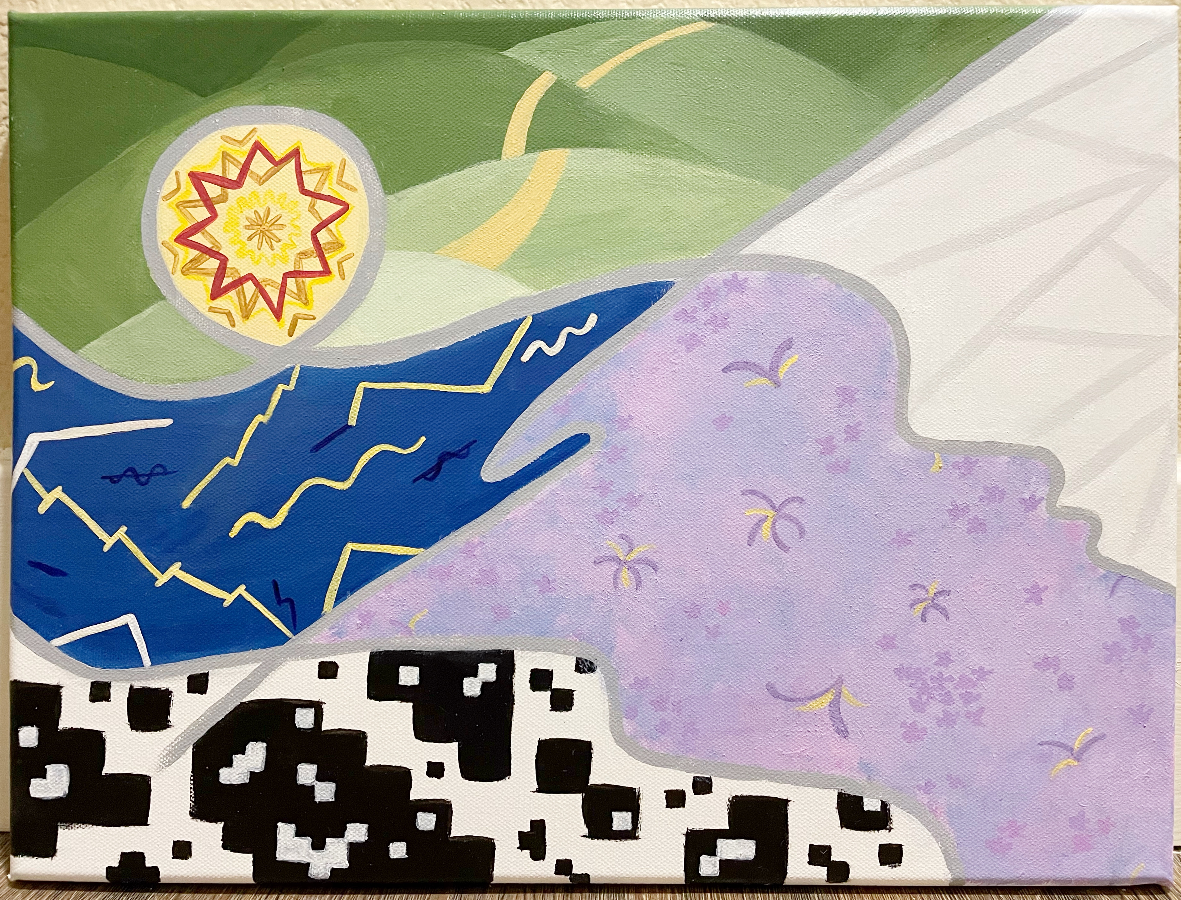
I have reimagined the concept from my previous painting that failed in execution. Today, I painted from 10am-7pm, plus ~3 hours of "post-production" (and touch-ups). In other creative news, Next in Fashion Season 2 is back, and I am loving it.

Concept summary: This painting is about foundations. Six elements in six foundational categories: natural elements, types of intelligences, life purposes, basic emotions, the six quarks and fun punctuations (not a foundation). I noticed midway that this resembles a subway line map, but I think it works because subways are underground where foundations are. ๐Ÿ˜‚

Overall assessment: I had a great time with the entire process; top 3 paintings in terms of enjoyment, a sign of personal growth.
-The visual concept came to me quickly, which is a phenomenon that always surprises me. This painting is a callback to my flower maze painting and my core style, being less abstract than my recent ones.
-A couple points of self-critique: I prefer the more organic feel of my original sketch, where I had looser lines that didn't align perfectly to a grid format. I didn't know how to recreate that in a painting.
-I also made a calculation error and added an extra row about 1/3 down. I could have used that extra space in the bottom instead. While at first this seemed like a major miss, it's more like a "happy little accident" looking at it now. 

All of these shortcomings can be attributed to lack of formal artistic study and also trying to go fast. But issues aside, I'm feeling less regret than I usually do. 8.5/10

Detailed commentary:
-The line colors are based on my iPad Notability palette, which I spent some time perfecting a while back, so it was nice to get more mileage from that.
-I tried not to overthink the icons, and just set the bar at elegantly simple but not too tropey. I redid an icon, so the old version is on my Insta and the new version is below. There were a couple other small details I didn't/forgot to optimize for (order of icons, which line goes on top).
-Noting that I needed to force-fit six elements per category. In particular, there are commonly eight intelligences, which I find to be excessive/indulgent anyway.
-Also noting I included the quarks category because I read about them in a book a long time ago and they fit the theme perfectly, but I fundamentally don’t know what quarks are.

Here’s the full log —
-Teal line (natural elements): fire, water, air, wood, stone, plants
-Magenta line
(intelligences): musical, logical, linguistic (mountain ie storytelling), relational, kinesthetic (sock), visual (squiggly)
-Lime green line (typical life purposes): for the moment, for growth/change, for influence, for knowledge/wisdom (notebook), for recognition (medal), for morality/deontological
-Wine red line
(basic emotions): happy, sad, angry (brick), afraid (monster in the dark), disgust, surprise
-Blue line (punctuations): asterisk, and, quotes, colon, bracket, degree
-Gold line (quarks): top, bottom, charm, strange, top, bottom

Original sketch

Epilogue: 
Thought #1
It occurred to me that I could have included seven deadly sins or seven senses (incl. balance and body awareness), perhaps instead of the punctuations. However, Sins seem to be quite similar to life purposes, and Senses are quite overlapping with intelligences. So that’s interesting

Thought #2
As a significant part of art is about expressing your style, the self-expression that I express today is structured thinking and colorfulness. Self-expression is very life-giving actually. It was on my long list of life purposes that I attempted to distill in a MECE way, and I think it is some combo of "growth" and "recognition".

Thursday, February 9, 2023

Random

I was cleaning up my OneNote, which I love to do. I love organizing my stuff in Google Drive, Windows Explorer, Spotify. Anyway, I came across a list of "New Year's" wishes that I was going to send on Christmas cards in 2021. I didn't end up doing it because printing was expensive and the Christmas card painting series didn't end up photographing well. But I remember drafting all these wishes when I couldn't fall asleep at 2am one night. I picked out a few here.

May all your dreams come true in 2021
May you go get 'em, girl
May you stay healthy and drink lots of water in 2021
May you always find 0% APR financing
May you never go without air conditioning in the summer
May you discover your all time favorite movie in 2021
May you sleep in without feeling guilty
May you keep on carrying on
May you just keep swimming
In 2021, may you enjoy good vibes, go hoos
May you work smarter, not harder
May you achieve the impossible and become even more amazing than you are in 2021

And then I wrote at the bottom...
"Oddly specific good things"
"Common phrases and generalities"
...to remind myself of the framework for how to write these wishes. Reading some of these again made me laugh; it's embarrassing but I seem to enjoy my own sense of humor. ๐Ÿ˜ถ

Monday, February 6, 2023

Just an Archive

I'm usually pretty self-critical about my paintings, but this one honestly feels like a dud. I'm posting it to keep an archive, but I'll keep this short and move on.

The original concept was to represent the MECE framework of life purposes that people can pursue. From top left to bottom right:
-Influence
-Personal evolution
-Recognition / approval
-Understanding
-Valuing the moment
-Moral rightness

In the end, I rushed through it in terms of visualizing the image and also executing. I'm not even putting this on my IG. Goodbye.

"Pieces"

Monday, October 24, 2022

"Splash"

It's amazing and economical that you can make a huge range of colors with just a few primary colors. Online guides typically direct you to nature-y primary colors, to achieve all the shades of tree trunk and dirt you could possibly envision. However, this excludes the whole section of bright and artificial colors that I prefer, and I have had to go through trial and error to collect a set of good primaries.

Without formal art training, I've sadly inadvertently bought a few shades that were not the most efficient way to achieve the widest possible range of color. 10 tubes of (not cheap) Golden acrylic paint and 2 years of painting later, I was amazed but also saddened to find tubes of color that could drastically expand my color range, meaning my existing tubes weren't sufficient.

The ones I recently bought were brights. This is what I surmise you really need for the full spectrum of all color: Warm and cool red, blue and yellow in three sets: bright, classic, and deep. Plus titanium white which has strong mixing strength (doesn't dilute easily), and perhaps some "convenient" colors that you use often and don't want to mix (eg true black). This totals 18+ tubes at $10-20/tube = ~$300

The theory of having all three bright, classic, and deep color families is that you need a way to keep high saturation in bright and deep colors, not just mix white or black into classics. However, reality isn't perfect, so even if this theory of 18 primary colors is true, I don't think it's that easy to accomplish. The perfect warm blue might not exist, because paint is derived from feasible/economical natural or synthetic sources. Things like purple and blue are apparently difficult to make, which that's why it's possible to have rare or impossible colors I suppose.

I find colors really lovely. I would be happy not to create any paintings and just get many tubes of colors to swatch and mix and observe them. In any case, I was very happy that my new brights were able to help me reach the full range of color in this painting. 

Regarding the painting itself, I like that you can orient this painting in any direction. Overall it was super satisfying and joyful to manifest a simple vision that I had for a couple weeks. (Although I envisioned the spray part to be more cartoony, and couldn't figure out how to illustrate it actually.)
In other news, I only made 2 paintings this year + a couple 5x7 panels.
In 2021, I made 5 full-sized projects + 2 addendums + 1 panel.
In 2020, I made 16 full-sized projects + 4 addendums + 15 panels.
This is almost exactly like my ebook and movie phases. High regularity for a year, periodic engagement in year two, and total rarity in year three (but also a sense of familiarity that I can pick it back up whenever I want). My key takeaway is it's nice to have a default hobby / momentum, but it comes at the expense of time for other things, so it's good to change it up too.

Sunday, August 7, 2022

Painting in Action: Self-expression and Decor

I'm less inclined to paint now that I have moved. No space, no time, no mom saying "I liked your other one better, but you can give this to me anyway". So I prefer simple designs that I can complete in two days, even if there's a 1.5 month gap between the days. This painting was meant to be sad and symbolic, but day 2 ended up being very calming.

Painter's notes:
The background -- yet another galaxy that never comes out as enveloping as envisioned. But there is a warmth here that I like.

The cracks were difficult as anticipated, hence the procrastination. At completion, I was surprised to find it slightly creepy, as opposed to the brokenness that I intended. It resembles "eyeball", "lightning", "web", that I wonder whether dark lines would have mitigated. However, the accidentally beautiful upside of light lines is the optical illusion, appearing lighter in the center and darker outwards on the SW-NE diagonals, which are a single shade in actuality.

Per usual, I was struggling to appreciate the piece at completion but quite happy with it after several days. The lines are clean as heck, and the swirls are my specialty. Swirls represent intuition, balance and calm -- all things I like.

Below are also a couple pieces I did for home decor, aluminum light gold birds completed in June and a cloud painting from October 2021. My apartment is sky-themed.
 
"Unforeboding Joy"


This painting is quite large actually. The width is longer than my entire arm. Probably not longer than yours.

Sunday, November 21, 2021

"Ether"

Though these days I don't feel like painting much, I wanted some painting catharsis this weekend.

This concept was not pre-planned, and I quite like it. I considered including an downpour of rain or shooting stars, but firstly I forgot, and secondly I'm not sure how that would work. I would love to attempt that idea sometime.

In terms of execution, the background gradient here was not painted in a highly intention manner, but the streaks are. These are the words that go with this painting: cast, light, move

The last time I did art was early October, and then a couple times in September (a couple gifts). In other news, I have begun working on a multi-canvas project for my forthcoming-new apartment, but that project has been continuously deprioritized (which is ok).
The sun and universe, with cosmic streaks

Sunday, April 18, 2021

Back to the Basics

The paintings I have done earlier this year have tended to be very quick and not deeply planned out.

This painting is more in line with my typical process, iterating until I'm happy with the concept. The result is:
1. This is the paradigm of my style.
2. This aggregates feelings from the past few weeks, as opposed to just one day. It is more balanced but less emotive.

The squares are life building blocks that you keep working to stack.

Technique
I'm pleased that my background gradient blended nicely. The color selection and pattern is random (read: not optimized), but it looks soothing from afar.

I also tried a new technique for the orange box, using twine to stamp. I envisioned using thin yarn for a cleaner look, but this ended up cool too.

Artist's Self-Critique
Overall, I'm surprised it turned out quite appealing. 

It's a smidgen too simple. If the white clouds showed up better and if I could think of something more to add in the empty spaces, that would have been better.

My favorite part is the black box with the chaotic scribbles. My least favorite part is the water bubbles  the border and color of the box are messy.

In spite of that, this might end up being one of my favorite paintings. (Maybe I should rank all my artwork sometime?! I love ranking things.) Looking back at the past few months of posts, I'm really happy that I'm taking the time to paint periodically. These pieces are like journal entries for my creativity, emotions and aesthetic as we go along.

"Building Blocks"

Addendum #6: Unicorn

I had lots of pastels lying around. It was perfect for this concept.

Now I'm starting to run out of ideas for Addendums where the lines are flowy. Will have to start experimenting with other types of lines and shapes.


Sunday, February 21, 2021

Learning Korean

Things have been busy lately, but I decided it would be good to make some art this weekend.

Swirls are usually easy, but they were difficult here because of the large space I had to fill. The final result is acceptable, but not as organic as I'd like.

You can see the swirls are traced in Korean lyrics, a shoutout to my new side hobby. As an adult, there are things I thought I wasn't good at or interested in that I have changed my opinion on. Learning a language is one of them. Apparently, my memory is not as bad as I thought, and I like the intuition required to understand the spirit of words.

I have a friend who is learning Korean like I am, and we agree that it is a particularly fun and interesting language. The writing is nicely uniform and, as with other languages, it's insightful to learn how cultural norms are imprinted into grammatical structure. 

Okay. With only the swirls on the canvas, I was dismayed that it was feeling unoriginal, looking suspiciously like Chinese Bible tracts I saw around the house in the 90's.

So I brought in some Little Twin Star vibes, and somehow that saved the painting. Done!
"Blossom". The yellow bits are warm metallic gold in person.

Addendum #5: Hair Bow

I quite like the concept of this Addendum. 

It's been sitting around, waiting to be completed for a while. It's time I clear it off the docket to start the next one, as I have a lot of purples in storage that couldn't fit here.

Saturday, January 2, 2021

Starting to Put It Together

Happy 2021!

Even though I typically don't make resolutions, one of my key goals nowadays is to appreciate both the negative and positive things in my life. I don't have to like everything, but it's good to recognize the inherent value in experiencing things. This approach should broaden and balance my perspective a bit more.

Moving on, I am very pleased to have made a painting so quickly at the start of this year. The concept was an engaging one, as I challenged myself to take the following elements and find a way to harmonize them: trees, water, fire, moon, stars, wispy clouds and swirling leaves (later changed to abstract specks).

I developed a backstory for how the elements fit together, but it's rather metaphorical and specific, so I don't think it's necessary to explain. As a result, this is one of the more non-literal paintings that I've made. Suffice to say, developing an underlying narrative from a loose theme made for a fun process. 

The painting also presented technical challenges in my key areas of growth, which are composition and nature realism. Overall, I rate the execution a generous 7.5/10.

Development
In making the sketch, the first question was how to depict fire, specifically a non-man-made one. You typically think of fire as a vertical object, but it needed to be horizontal to agree with everything else. Thus wildfire on the plains worked really well.

I didn't want fire to be the focal point, so I kept its footprint small. Instead, I built the point of interest around the coil where the cloudy haze and the swirling specks intersect. With those key points in place, the rest of the elements quickly got sorted out.

Evaluation
Overall, the painting is pleasantly subtle. It could have afforded more brainstorming time to improve the composition and more painting time to improve the natural texture. (More detailed commentary at the bottom.)

On the other hand, I'm very impatient these days. Many an idea has been lost to refinement-purgatory, so I'm glad I was able to manifest a fairly cohesive piece.

In conclusion, though it's lacking in some ways, I made it with care, with the dexterity that I've been developing, with an eye that distinguishes my style, and with an idea that came from my heart. Happy start of a new year and may we have the best year we can!
"Coherency"

Additional commentary and points for improvement:
For better composition, I could have unified the elemental shapes under a stronger rule/pattern. Additionally, the cloud coil should be more natural, the swirling specks should be simpler, the smoke from the fire should be more inspired, and the stream is overall very wonky (complicated by my inexperience with perspective). I'm not entirely sure that the placement of everything is right either.

Interestingly, the top and bottom half of the painting look all right separately.

As for nature-painting technique, the grass and stream are too flat and it only just now occurs to me that the fire should emit a glow onto surrounding grass.

Anyway, I better try to workshop each of these skills separately in the future, and stop analyzing this painting now.